Cabochon
Polishing a medical brand
Their Goliath
With Cabochon, the investors at the Foundry, a medical device incubator based in Menlo Park, knew they had a hit on their hands. They were also aware that their new device’s existing brand didn’t differentiate it in the crowded aesthetics surgery market.
Our Solution
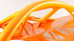
The device had a unique mechanism of action and name to match: Cabochon, or “a highly polished gemstone.” Competitive analysis uncovered a key technical differentiator: precision. We used this mixture of polish and precision to define the product’s visual identity and messaging.
Services Provided
Brand Strategy
Positioning
Tagline
Logo
Identity Design
Brand Strategy
While “The scientifically proven, lasting treatment for cellulite” is descriptive, it’s by no means memorable. I created a tagline that focused on two essential words: Precision Matters. This highlights the product’s primary differentiator, while calling into question competitors’ ability to deliver it.

Identity Design
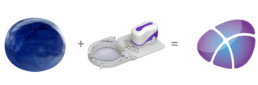
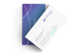
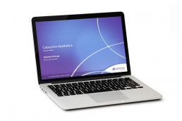
Cabochon’s existing identity featured an outdated color palette and ubiquitous “swoosh” logo. My design partner, SpiroLab, created a novel way for Cabochon’s new brand to reflect both the curves of a polished stone and crosshairs representing precision.
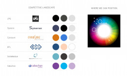
Reviewing their competitors’ identities, we uncovered a unique and sophisticated color space that would resonate with aesthetic-minded aesthetic surgeons.
We extended Cabochon’s new brand across all core marketing touchpoints: web landing page, investor presentation, and business cards.
“The brand bible you built gave us an excellent foundation.”
Cabochon Business Lead
The Results
Cabochon’s shiny new brand helped attract acquisition by Ulthera within one year of its introduction.